The fastest way to make family portraits feel stressful is to wait until the night before and realize everyone planned a different version of “dress nice.” One person is in a bold floral print, one is wearing neon sneakers, and one child has decided a superhero shirt is non-negotiable. Good photos can still happen, but polished, cohesive portraits usually start with a clear wardrobe plan.
What you wear shapes the entire look of your gallery. Clothing affects color balance, visual harmony, how timeless the images feel, and even how relaxed everyone appears on camera. The goal is not to make your family look overly styled or identical. It is to create a coordinated look that feels natural, elevated, and true to your family.
What to wear for family portraits starts with coordination
The best family portrait outfits are coordinated, not matched. That distinction matters. When everyone wears the exact same white shirt and jeans, the result can feel dated and flat. When outfits share a color palette and similar level of formality, the images feel more refined and story-driven.
Start by choosing two to four colors that work well together. Soft neutrals, earth tones, muted blues, sage, rust, cream, tan, dusty rose, and warm gray tend to photograph beautifully in a wide range of settings. On Oahu, these tones also work especially well with beach, park, and sunset locations because they complement the landscape instead of competing with it.
Once you have a palette, spread those colors across the family instead of putting everyone in the same shade. For example, one person might wear a light beige dress, another a soft blue button-down, and another tan pants with a cream top. That variation creates depth without looking random.
Choose outfits based on location and light
A family session at the beach calls for a different wardrobe approach than portraits in a garden, downtown setting, or at home. This is where styling becomes practical, not just aesthetic.
For beach portraits, lighter colors and breathable fabrics usually work best. Linen, cotton, gauze, and soft-flowing materials move well in the breeze and suit the relaxed elegance of coastal photos. Bare feet can work beautifully in some beach sessions, but it depends on the look you want. If you want a more polished result, simple sandals or neutral footwear may be the better choice.
For park or nature locations, earthy and muted tones often feel most natural. Olive, rust, cream, soft blue, and warm neutrals blend well with greenery and golden-hour light. In more urban settings, you can lean slightly more structured – think clean silhouettes, classic dresses, button-downs, or well-fitted casual pieces that still feel comfortable.
Lighting matters too. Bright midday sun can make very stark white appear harsh, while very dark clothing may lose detail in shaded areas or evening light. Mid-tone colors often photograph more consistently and keep the final gallery balanced.
Keep the formality level consistent
One of the most common styling mistakes is mixing outfit levels that do not belong together. If one parent is in a flowing dress and polished shoes while another family member is in gym shorts and a graphic tee, the mismatch stands out immediately.
Before anyone shops or pulls clothes from the closet, decide on the overall dress code. Are you going for elevated casual, polished and dressy, or relaxed beach formal? Once that is clear, every outfit should support the same visual tone.
This does not mean every family member needs to look equally dressed up. Small children, especially, should still look like children. But everyone should look like they are part of the same session. A coordinated level of formality helps your portraits feel intentional and premium.
The best colors for timeless family portraits
If your main priority is creating images that still look current years from now, color choice deserves extra attention. Trend-heavy colors can date photos quickly, while balanced, understated palettes tend to last.
Neutrals are reliable for a reason. Cream, ivory, beige, taupe, camel, soft gray, and muted navy photograph cleanly and keep attention on faces and connection. Soft pastels can work beautifully too, especially for spring sessions or lighter outdoor settings. Richer tones like deep green, burgundy, and burnt orange can add warmth in the right season or location.
There are trade-offs. An all-neutral palette feels clean and elegant, but it can look a little flat if there is no texture or contrast. Adding one or two accent colors, along with fabric variety, usually solves that. On the other hand, very bright colors can bring energy, but they often pull attention away from expressions.
If you are unsure, aim slightly softer than you think you need. Muted tones tend to photograph more beautifully than highly saturated ones.
Patterns, logos, and texture: what helps and what hurts
Patterns are not automatically a problem, but they need restraint. One subtle floral, plaid, or small-scale print can add personality. Several competing patterns in one frame can make a portrait look busy fast.
Large graphics, visible brand logos, and text on shirts are usually best avoided. They distract from the emotional focus of the image and can make an otherwise timeless portrait feel casual in the wrong way. Neon colors have a similar effect. They reflect color onto skin and can overpower the composition.
Texture is often the better way to create visual interest. Linen, knits, embroidery, eyelet details, and layered fabrics photograph beautifully without overwhelming the image. Texture adds depth while keeping the look cohesive and elevated.
Dress the most difficult outfit first
If one family member is hardest to style – often mom, a teen, or a toddler with strong opinions – start there. Build the rest of the wardrobe around that piece.
This approach is more efficient than trying to choose everyone else’s clothing first. For example, if the anchor outfit is a soft blue dress with subtle texture, you can pull complementary tones for the rest of the family with much less guesswork. That single piece can guide the color palette, formality, and overall mood of the session.
It also helps reduce last-minute decision fatigue, which is often what turns wardrobe planning into stress.
What parents and kids should keep in mind
Adults usually focus on how an outfit looks. For children, comfort matters just as much. If a child is itchy, too warm, or constantly adjusting stiff clothing, it will show in the photos.
Choose pieces that fit well and allow movement. Children should be able to sit, walk, and be held comfortably. For babies and toddlers, simple outfits in soft colors usually work best. Avoid overly busy prints, character clothing, or anything that requires constant fixing.
For parents, fit matters more than trend. Clothing that is too tight, too loose, or unfamiliar often reads as discomfort on camera. The most flattering choice is usually something structured enough to photograph well but comfortable enough that you can move naturally, hold your kids, and relax.
A few details people forget
The outfit is only part of the frame. Shoes, undergarments, accessories, and grooming all contribute to the final look.
Shoes should match the outfit’s formality and color palette. Athletic sneakers are one of the most common distractions in family portraits unless the session is intentionally casual. Accessories should be simple and supportive, not dominant. Delicate jewelry, a classic hat for the right setting, or a subtle hair accessory can work well.
Wrinkled clothing, visible bra straps, bulky pockets, smart watches, and hair ties on wrists often go unnoticed until the gallery arrives. A quick full-length mirror check before leaving for the session can prevent most of these issues.
What to wear for family portraits if you want less stress
If you want the process to feel easier, choose outfits at least one week in advance and lay them out together. Seeing everything side by side helps you spot issues with color, balance, and formality before the session day.
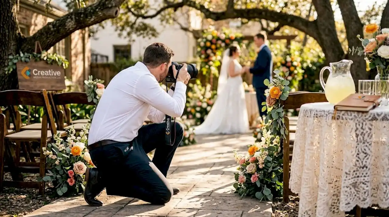
Take a phone photo of the full set of outfits in natural light. This is a simple way to see whether one piece feels too bright, too dark, or out of place. If you are booking with a professional team, asking for wardrobe guidance during planning can save time and help you avoid common mistakes. At Creative Media Production LLC, that kind of preparation supports a smoother session and a more polished final gallery.
Family portraits do not need perfect wardrobes. They need thoughtful choices that photograph well, feel comfortable, and let your connection stay at the center of the frame. When your outfits work together, the images feel effortless – and that is usually what makes them last.